Work / Host Capital
Host Capital
A design system for a business dashboard

v1.4 · October 2026
Foundations · Tokens · Components · Screens
Host Capital Design System
Overview
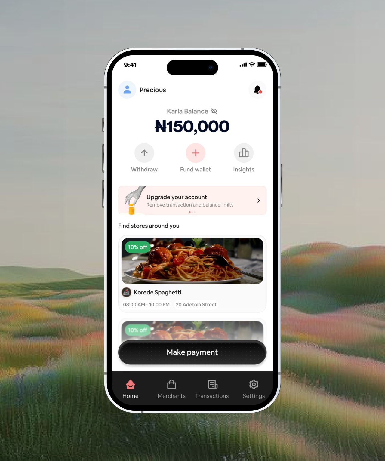
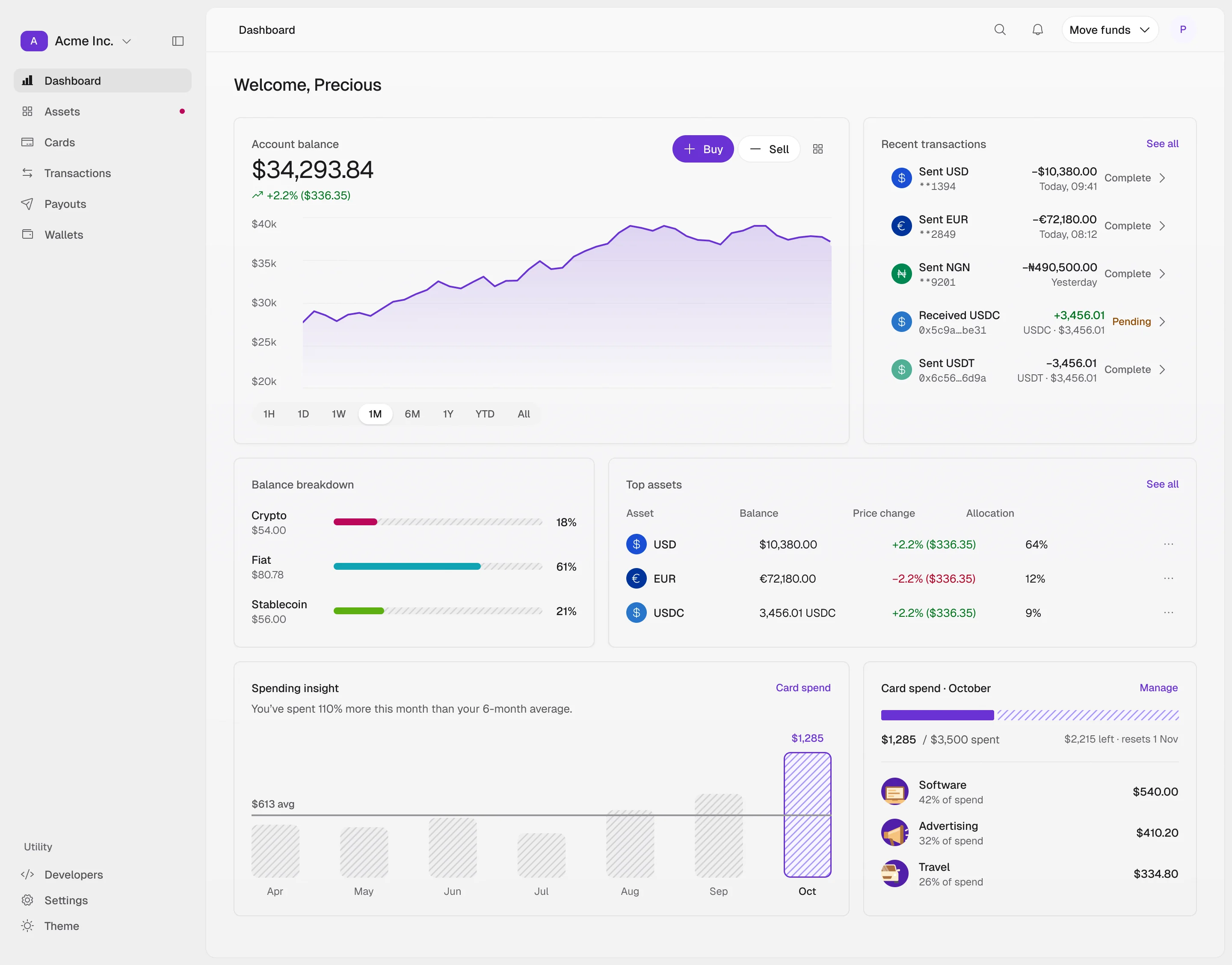
A design system for the Host Capital business dashboard, built in Figma from tokens up: its own type, grid and colour, then components, then the screens they make.
- Role
- Product Designer
- Scope
- Design system, design tokens, component library, dashboard design
- Timeline
- 2026
Foundations
Nine OKLCH colour ramps anchored on the dashboard's own colours, plus a slightly cool neutral. A step number means the same lightness in every hue. Semantic tokens sit on top, so a component asks for “text secondary”, never a hex value. 23 text styles cover everything from headlines to mono codes.
Geist
Regular · Medium · Semibold
numeric/large
- 2
- 4
- 6
- 8
- 12
- 16
- 24
- 48
- 50
- 100
- 200
- 300
- 400
- 500
- 600
- 700
- 800
- 900
- 950
- 0
- 50
- 100
- 200
- 300
- 400
- 500
- 600
- 700
- 800
- 900
- 1000
Components
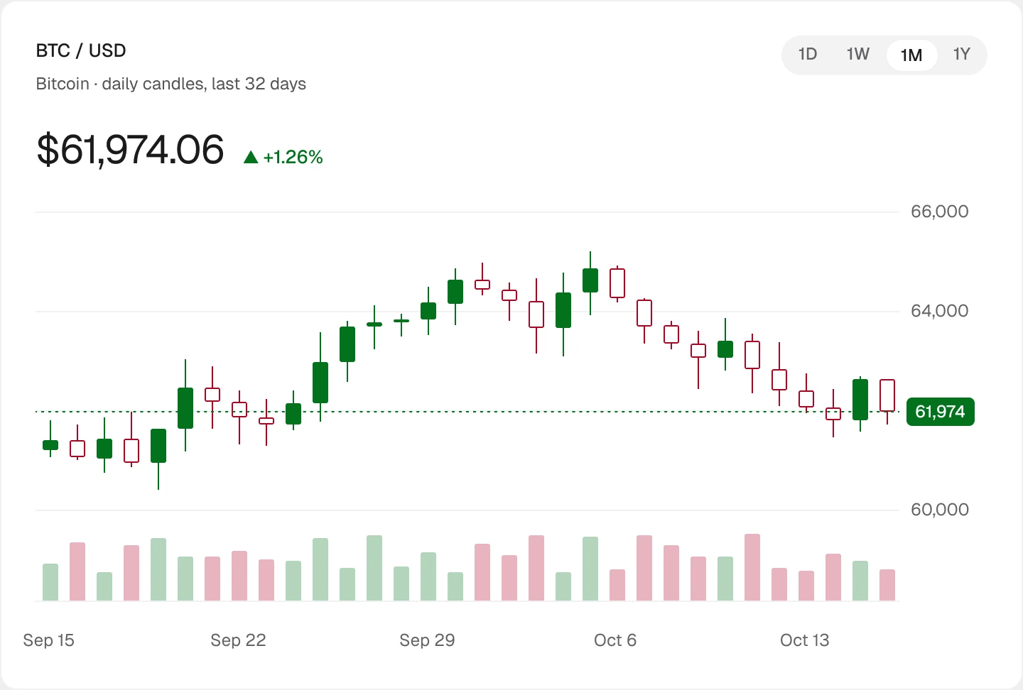
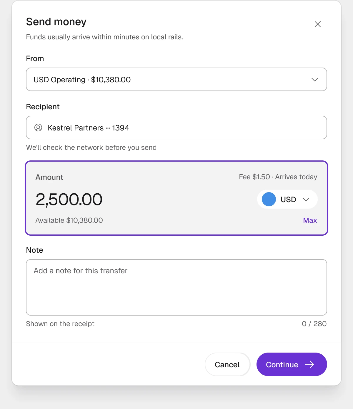
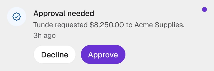
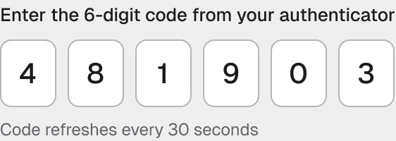
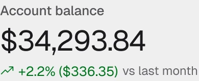
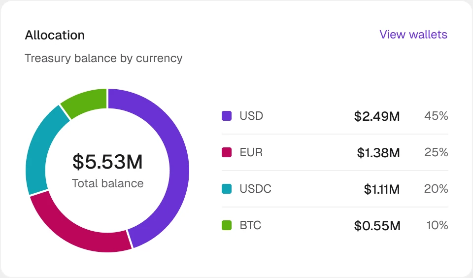
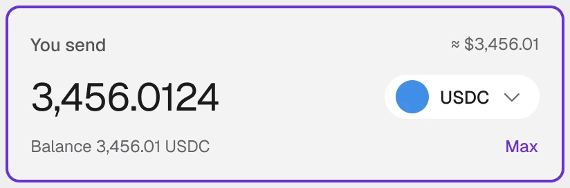
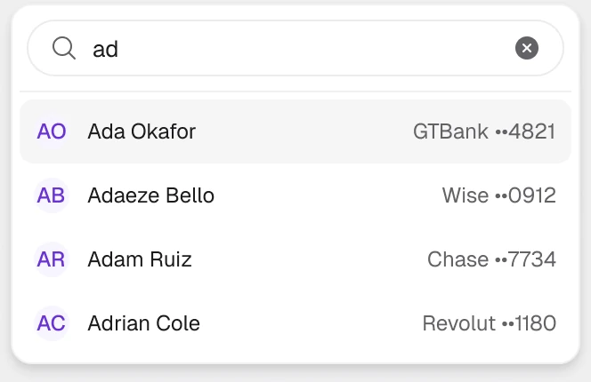
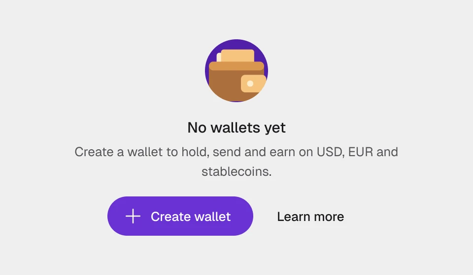
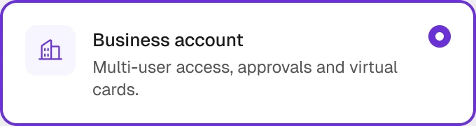
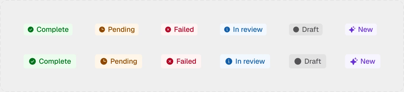
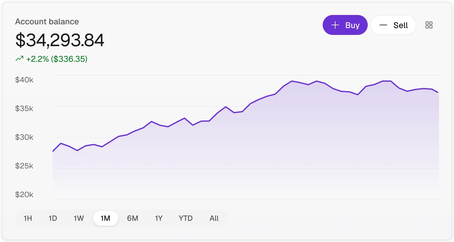
68 components and 456 variants, each built only from tokens: inputs, selects and one-time codes, tabs and steppers, badges, toasts and notifications, modals, and a full set of finance charts. Every part ships with its states, so screens are assembled, not drawn.



Putting it together
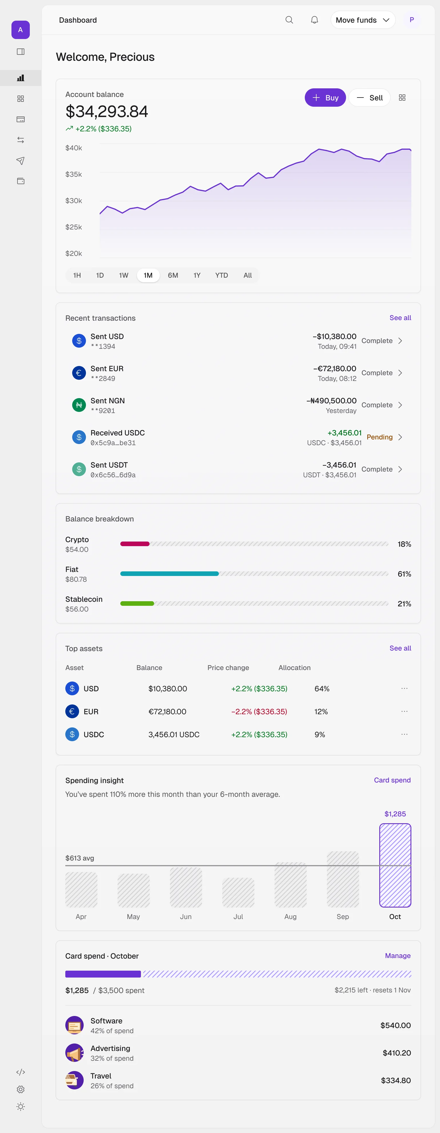
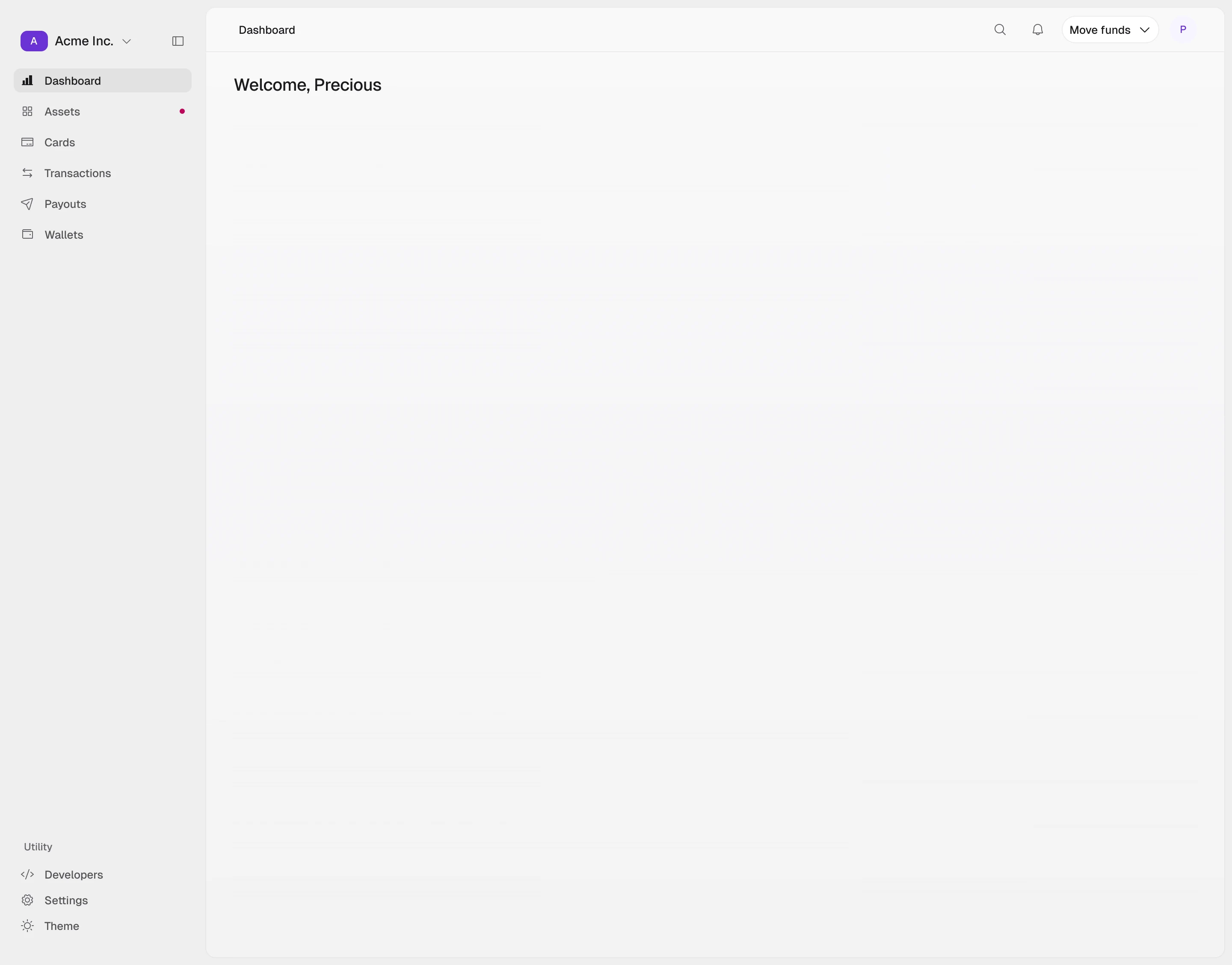
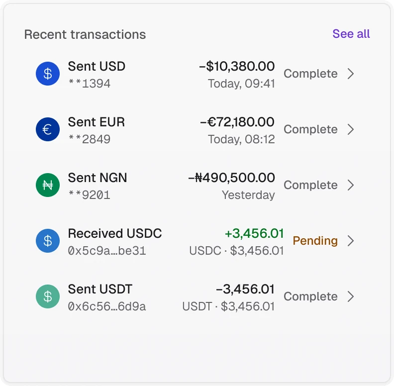
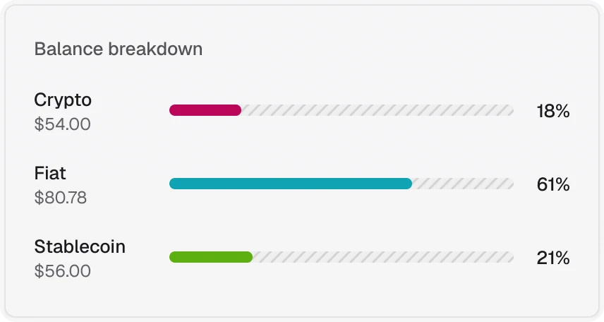
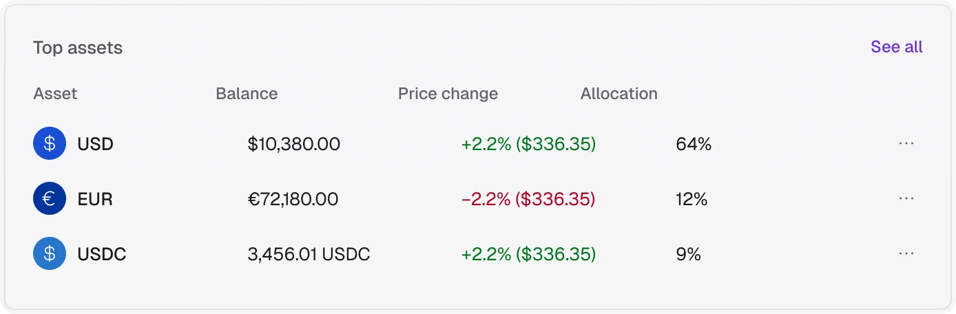
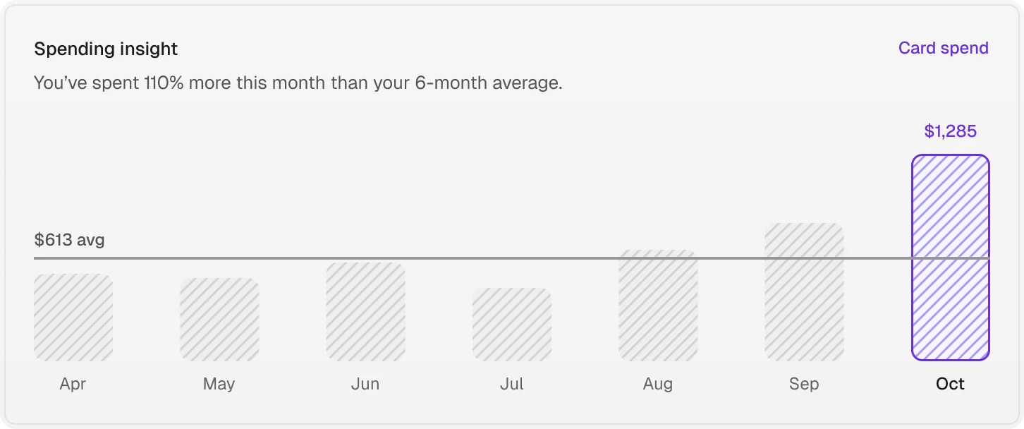
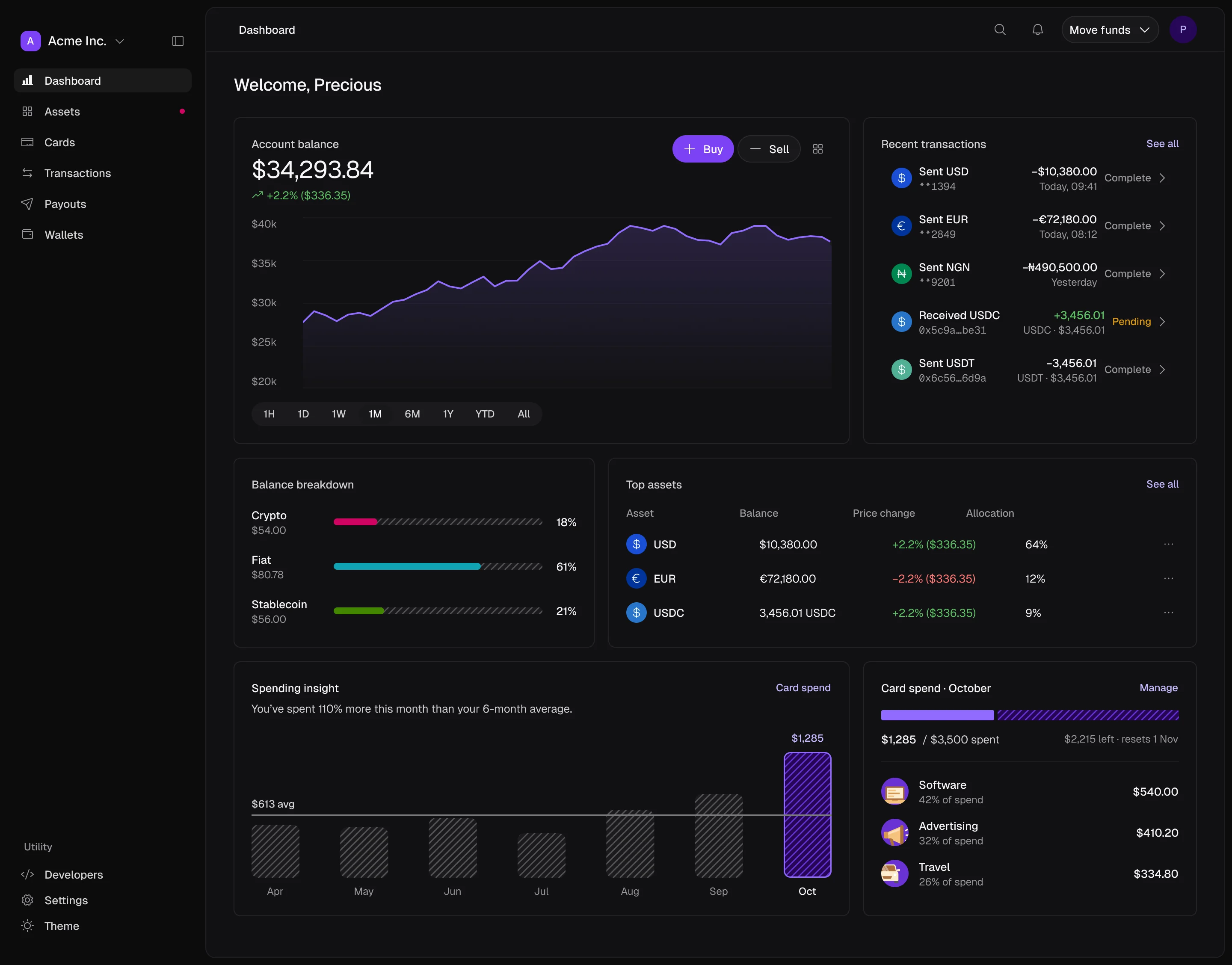
Tokens make components, components make cards, and cards make the dashboard. Every card on the overview is a library instance, placed on the grid with 16px gaps.
- Tokens
- Components
- Cards
- Dashboard
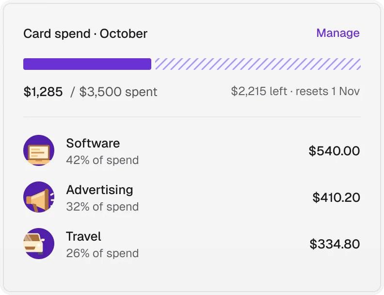
Light and dark
Dark mode is a second set of token values, not a second set of components. Switch the mode and the same dashboard renders dark.
Every breakpoint
Four breakpoints, from 1440 desktop to 375 mobile. The sidebar collapses to icons on tablet and hides on mobile, and the cards reflow from two columns to one.
- Desktop 1440
- Laptop 1024
- Tablet 768
- Mobile 375